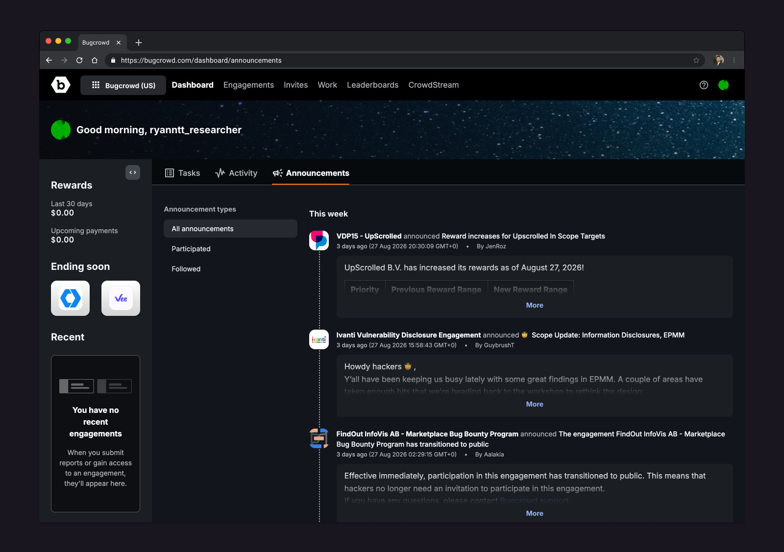
Bugcrowd is a cybersecurity platform that connects organisations with a global community of security researchers, often referred to as hackers in the community. During my time on the Product Design team, I worked on the researcher side of the platform: the places where researchers discover programs, understand what needs attention, and stay connected with important program updates.
My work was spread across three connected areas: the Researcher Dashboard, supporting product work around program discovery and researcher identity, and the Design System. I worked from research and problem framing to interaction design, visual design, responsive behaviour, implementation details, PR collaboration, and documentation for designers and engineers.
Context and problem
Researchers had to go to multiple places to understand updates, tasks, programs, payments, and performance. Email carried too much important communication, which made it easy for researchers to miss program announcements or lose track of what needed action.
The existing dashboard behaved more like a profile and performance page than a useful home base. It showed some important information, but it did not clearly help researchers understand what changed, what mattered, and what to do next.
Program discovery had related friction. Researchers needed to evaluate programs based on relevance, scope, technology, payout, timing, and application status, but the experience had issues around loading, filtering, and clarity.
Reframed challenge
How might we make Bugcrowd feel like a clearer working place for researchers, while turning recurring interface problems into reusable product patterns?
Designing for researchers
The Researcher Dashboard was the main product-design thread of my Bugcrowd work. The objective was to turn the dashboard into a central hub for tasks, activity, program updates, performance, rewards, and next steps.
The challenge was not just to add more information. Researchers already had too much scattered information. The better question was how to organise the right information into an interface that helped them make decisions without depending on email.
I synthesised researcher and stakeholder feedback, explored dashboard patterns, and worked through an interaction model based around cards for activity, tasks, announcements, and program content. The card model let different types of content share a common structure while still supporting different states, lengths, and levels of detail.
The design work included responsive navigation, expandable content, filters, collapsible sidebar behavior, and light and dark mode considerations. I also collaborated with engineering on implementation details and PR feedback, including layout simplification, icon reuse, copy consistency, and how product-specific needs should work with the Design System rather than fight it.
We wanted active researchers to understand their rewards, tasks, and recent activity quickly. At the same time, returning researchers needed a way to discover relevant programs and get back into security research without having to rebuild context from several places.
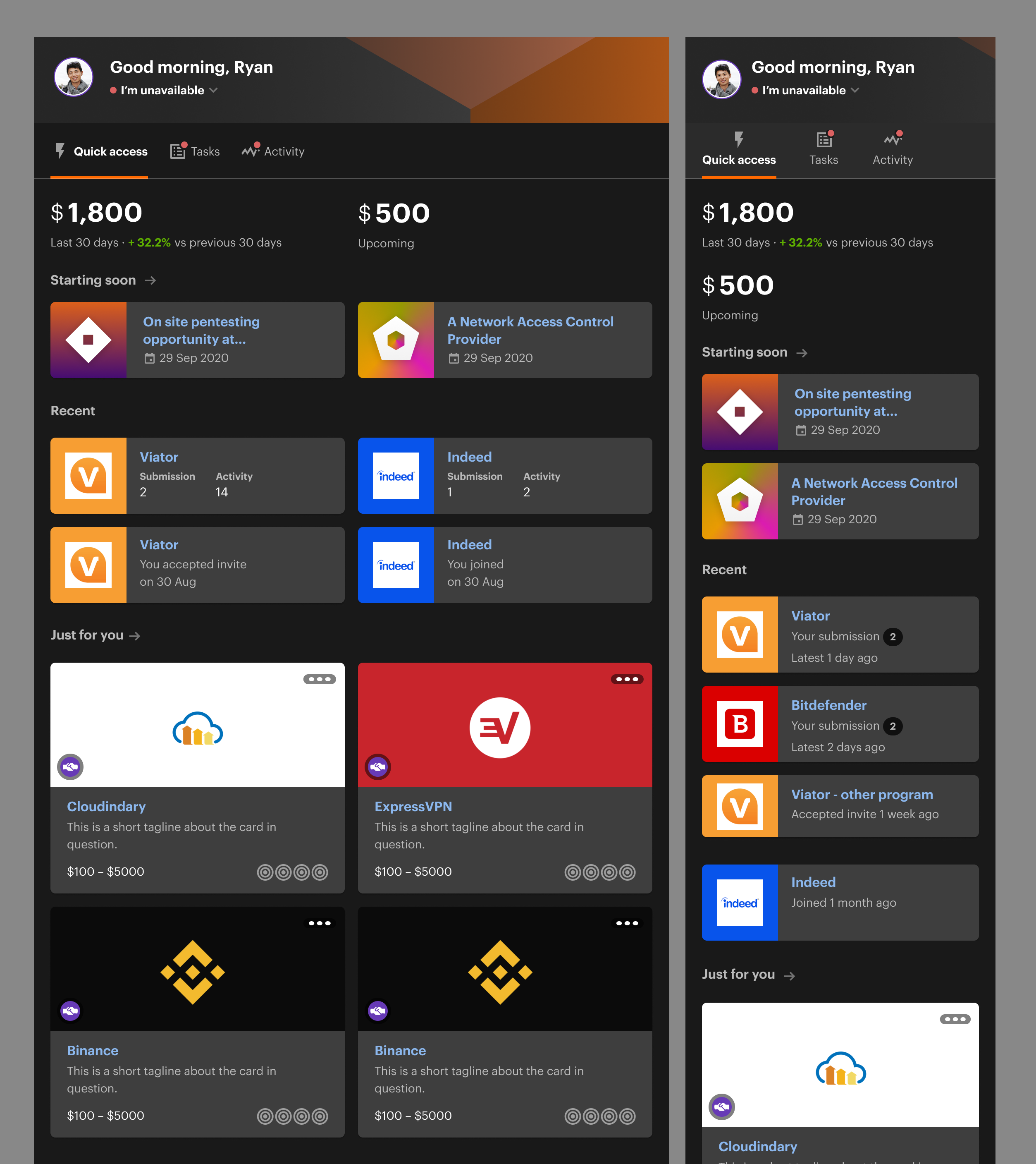
The design is responsive so researchers can check their status on different devices.
In the end, the dashboard became a clearer in-product place for important researcher updates. It reduced reliance on email for program communication and made important information easier to find. Program discovery became a meaningful entry point into the researcher funnel, contributing more than 20% of new program participants, with higher click engagement than email-based communication.
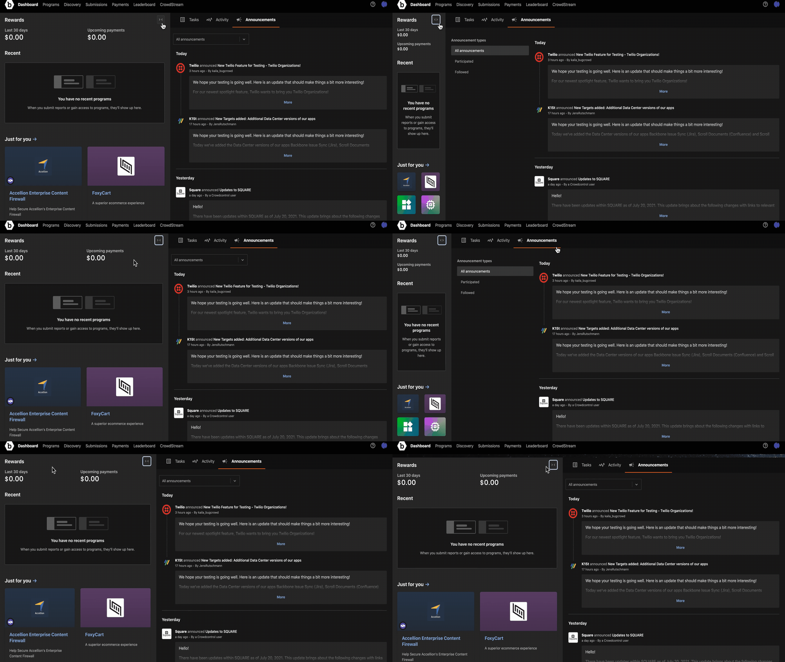
The announcement column on the right and the summary column on the left can collapse to support different working modes.
The new dashboard was launched in November 2020 and received positive feedback from the Hacker Success team and researchers. The Bugcrowd docs page still describes the Researcher Dashboard as a hub for rewards, engagements, tasks, activity, and announcements.
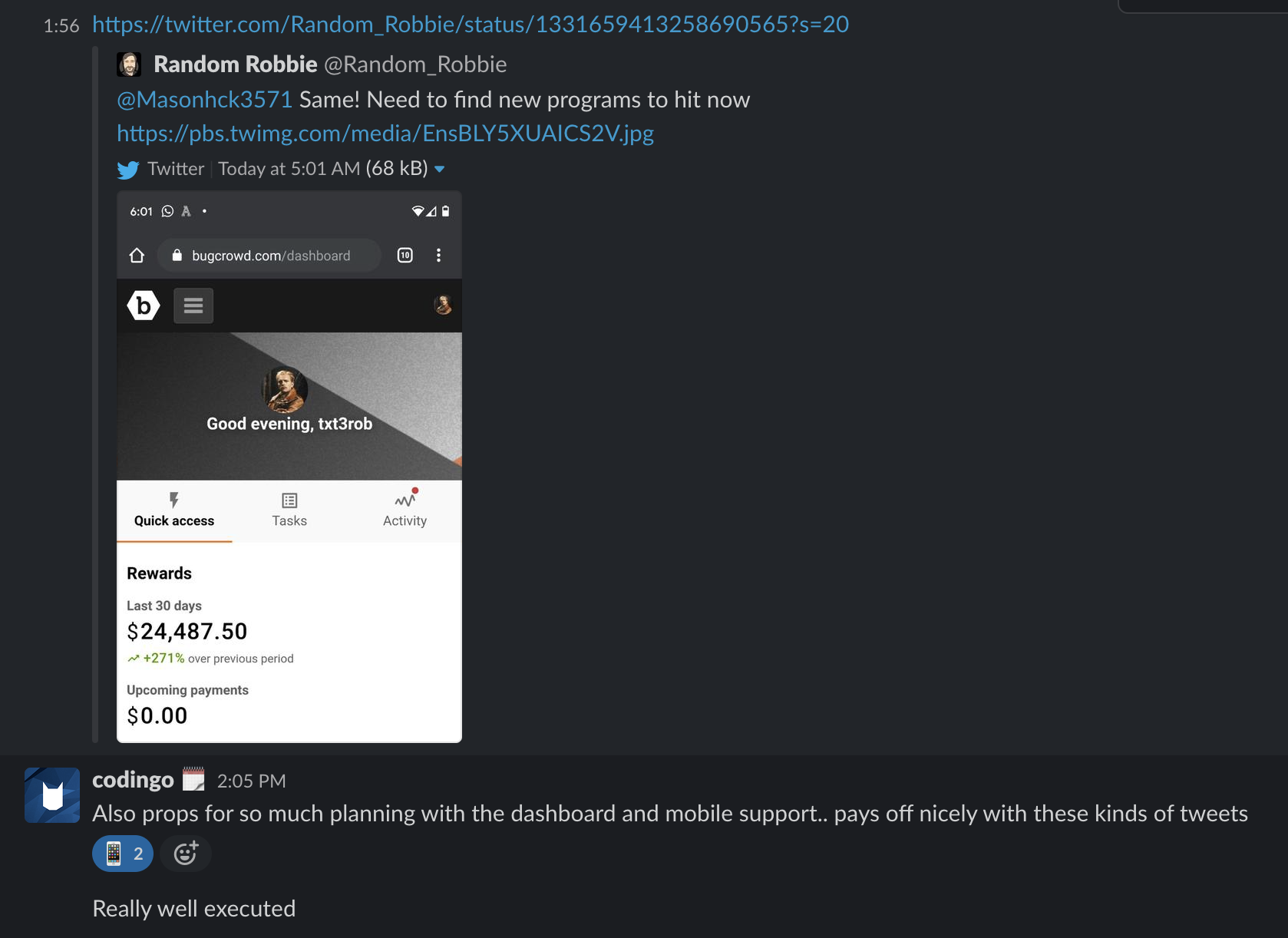
One of our Researcher Success managers forwarded a researcher's feedback to our product channel.
One design detail I am proud of is the collapsible layout behaviour. It allowed the dashboard to support different working modes without forcing all information to compete for attention at the same time. The design received positive feedback from our product team.
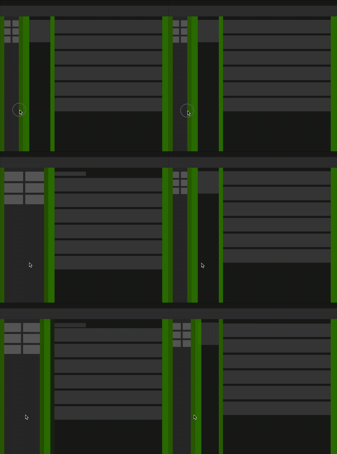
A layout pattern I proposed in the Design System.
The dashboard also exposed recurring product needs that belonged beyond a single screen: cards, stats, trends, spacing, responsive layouts, link colour, and content patterns. This made the Design System work feel closely related to the product work, rather than a separate track.
Design System work
While the dashboard was the user-facing project, the two tracks were never separate. Recurring product problems like layout behaviour, component states, spacing, and link colour needed system-level answers. I contributed to Bugcrowd’s Design System with a focus on turning those product problems into reusable patterns that designers and engineers could rely on.
The challenge was that product work needed more than static design files. It needed shared patterns and clearer guidelines that could be referred to when building any product screen, not just the dashboard.
I researched design-system examples and content guidelines, including how other teams documented tone, numbers, labels, and component usage. I also learnt React, TypeScript, Storybook, Sass variables, icon behaviour, and component styling. It helped me understand how design system can solve real product details such as dashboard layout, icon usage, copy, spacing, and responsive patterns.
The impact was partly product-facing and partly team-facing. The Design System work supported more consistent UI decisions and gave me a stronger shared language with engineers when discussing how product designs should be implemented.
Some of my work included:
Foundations. I worked on link colour because the platform uses links heavily for navigation. The adjusted blue kept links prominent across both light and dark themes. I also worked on spacing helpers so engineers could match design spacing more quickly.
Layouts. I contributed to common layout patterns to raise the bar for design consistency, and researched, designed, and implemented horizontal scroll in tables so dense data stayed usable across supported screen sizes.
Components. I worked on trust badges, which visualise the Trust score in CrowdMatch. I also worked on Trend and Stats components, which directly powered the dashboard project.
Design System references: Link colour · Spacing helpers · Common layouts · Trust badges · Trend · Stats
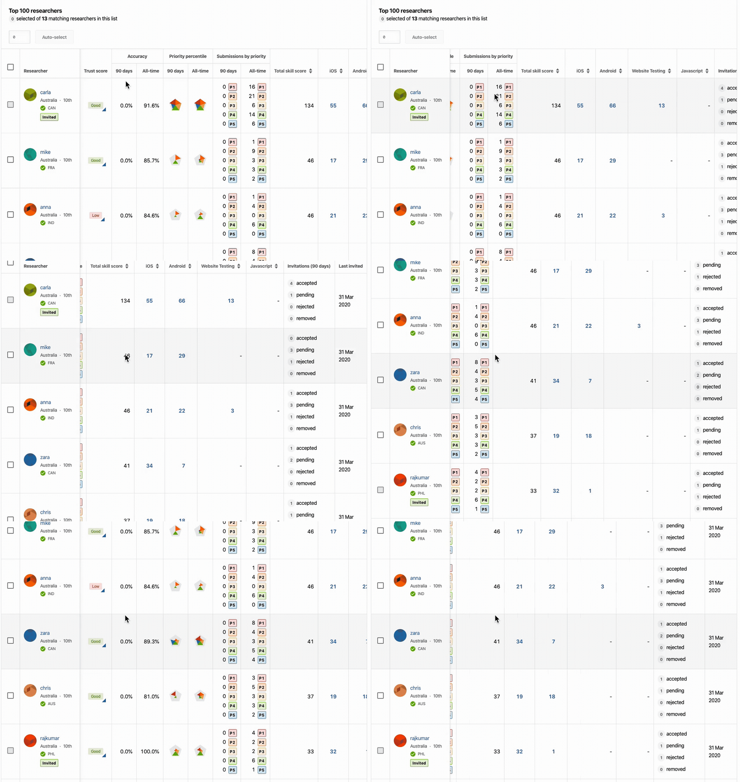
Horizontal scroll in tables helped dense data stay usable across supported screen sizes.
Supporting work
Beyond the dashboard and Design System, I contributed to several product areas that shipped as part of the broader researcher experience.
Program discovery and personalised programs. I researched how researchers choose programs and explored ways to surface relevant ones more easily. This included curated categories such as Trending or Quick Payout, and research into what information researchers actually use when deciding whether to participate.
Joinable and waitlisted program flow. I worked on the application experience, addressing pain points around repeated application text, unclear timing, and poor visibility into which programs a researcher had already applied to.
Researcher skill tags and staff endorsement. I defined requirements for staff-endorsed researcher traits used across CrowdMatch, submissions, and admin profiles: autocomplete, explanation text, strength scores, and where endorsements should appear.
Commenting. I designed a comment box supporting Markdown, private comments, and file attachments, embedded across multiple platform contexts. Working with full-stack engineers, I styled and polished the functional UI to match the intended design.
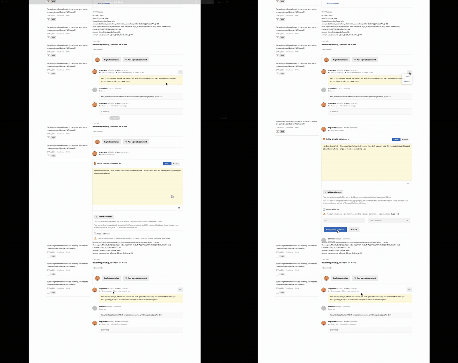
Editing a private comment.
Results
The product impact was a clearer researcher hub, less dependence on email, and better support for program engagement. The dashboard work helped move important updates into the product experience and gave researchers a more coherent place to understand what needed attention.
The team impact was a stronger shared language between design and engineering. The work around Design System research, component behaviour, and product implementation details helped reduce the gap between design intent and implementation.
The personal impact was learning to wear two hats at once. Working across both product design and Design System design meant solving the same problems from two angles: what the interface needed to communicate, and what the system needed to support. Each perspective made the other sharper.
Reflection
The approach that defined my work was connecting research, UI systems, and implementation. The dashboard became stronger when it was treated not only as a screen, but as a system of content, states, navigation, and reusable patterns. The Design System work also became more meaningful when it was connected back to specific product problems.
The hardest challenge was working through design debt while patterns were still evolving. The card model, responsive behaviour, and design-system constraints all had to be solved inside a live product rather than in a clean-room process.
I learnt that product craft and system craft are connected, but not automatically. They become connected through specific moments: a layout that needs to adapt better, a component that needs clearer behaviour, a label that needs to communicate intent, or a piece of feedback that reveals what the interface failed to explain. The work in Bugcrowd made this relationship visible to me.
All information in this case study is my own and does not necessarily reflect Bugcrowd's view.