App update is a place that people hardly pay attention to. It is mostly filled with a long list of bug fixes and new features that are similar to the product backlog of product development sprint. Maybe it is the product manager that writes the copy, which includes common key words such as:
- This release includes following updates
- Bug fixes, performance improvements, enhancements, minor improvements (Really? so why did you guys bother to release?), fixed
- New features, what’s new, new
It’s not about being interesting
The main problem with highly technical copies is that they are hardly read by user, which is unfortunate since users do need a reason to press the button Update. The feeling of owning something better when pressing the button is being ignored. Is it because it take less than 1 minutes to update the app so no user bother reading it?
Developers push updates with new features, which rely on user on-boarding to be introduced to users. People spent a big budget on on-boarding new user and user retention while skipping one of the most cost-effective place, the app update.
In (content) design, the aha moment can come at the time and place that no one else has ever thought of or no courage to venture in.
The blend of information and personality
I love app updates that are playful and engaging. For example, when you are a StarWars fan boy, you can feel the awesomeness in this brilliant copy from Hipmunk. Darth Vader was mentioned!
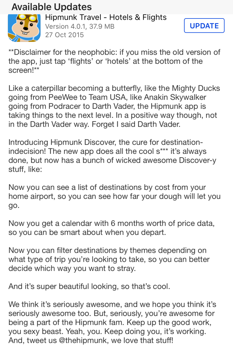
Hipmunk personality is always fun and witty. It makes me think H in Hipmunk stands for Hipster. Pay attention to their choice in copy:
- Casual: s***, sexy, awesome, wicked, love, super, cool.
- Cultural references: Mighty Ducks, PeeWee, Team USA, Anakin Sky Walker, Darth Vader, Discovery-y.
Good app update can represent the product’s personality
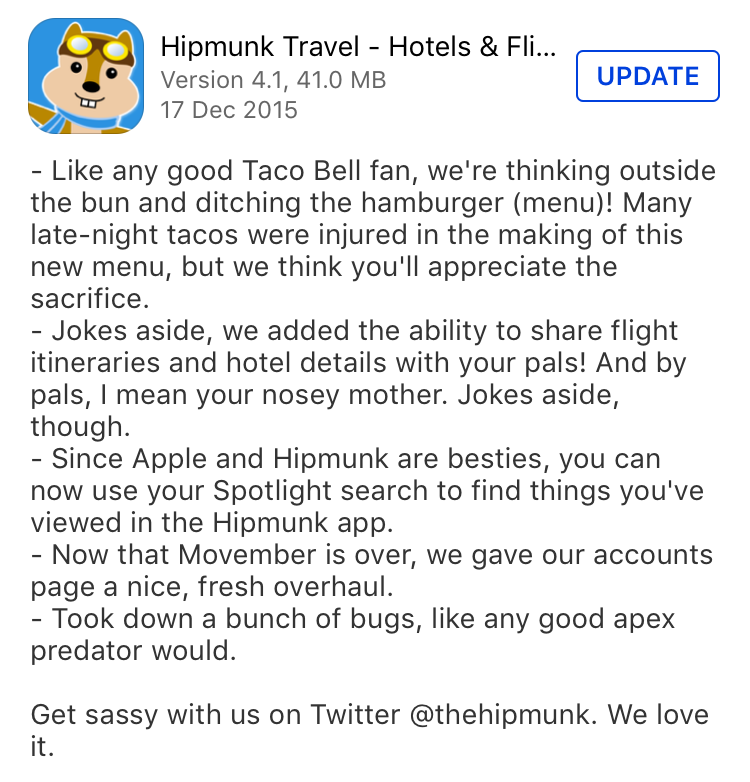
Using a different approach, Medium gave little exercise to your brain and introduced important changes at the end. They sure love Scramble.
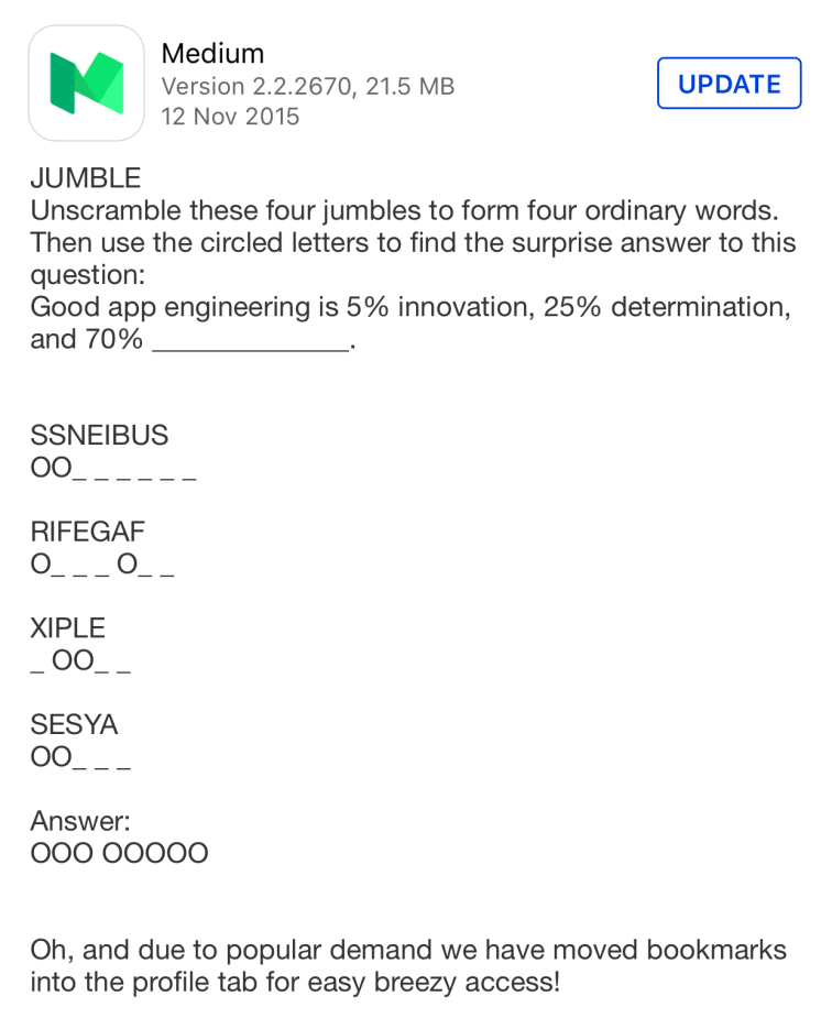
Medium app updates have a consistent sense of humour with stories. The summary of new features and changes at the end is always helpful. To me, Medium has this cool vibe that welcome people to update the app with ease of mind.
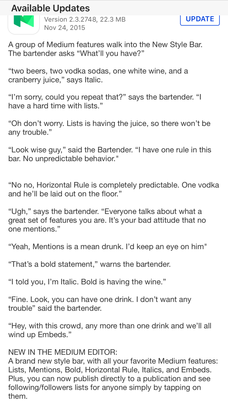
And this was their gift for Star Wars fans as well.
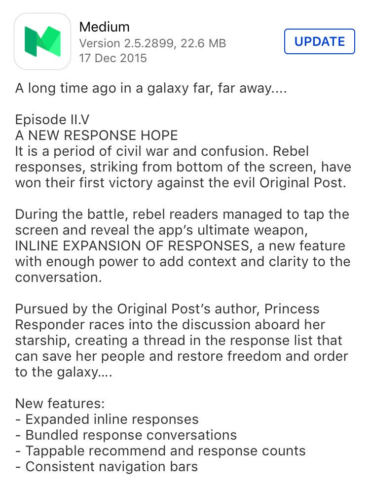
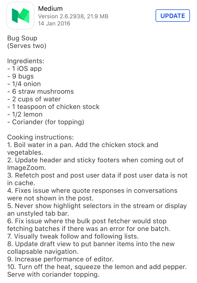
Someone was cooking and writing this update. I guess Medium may have different people writing app updates. Otherwise, who is this cool person? Must be someone love cooking, telling witty joke and a Star Wars fan.
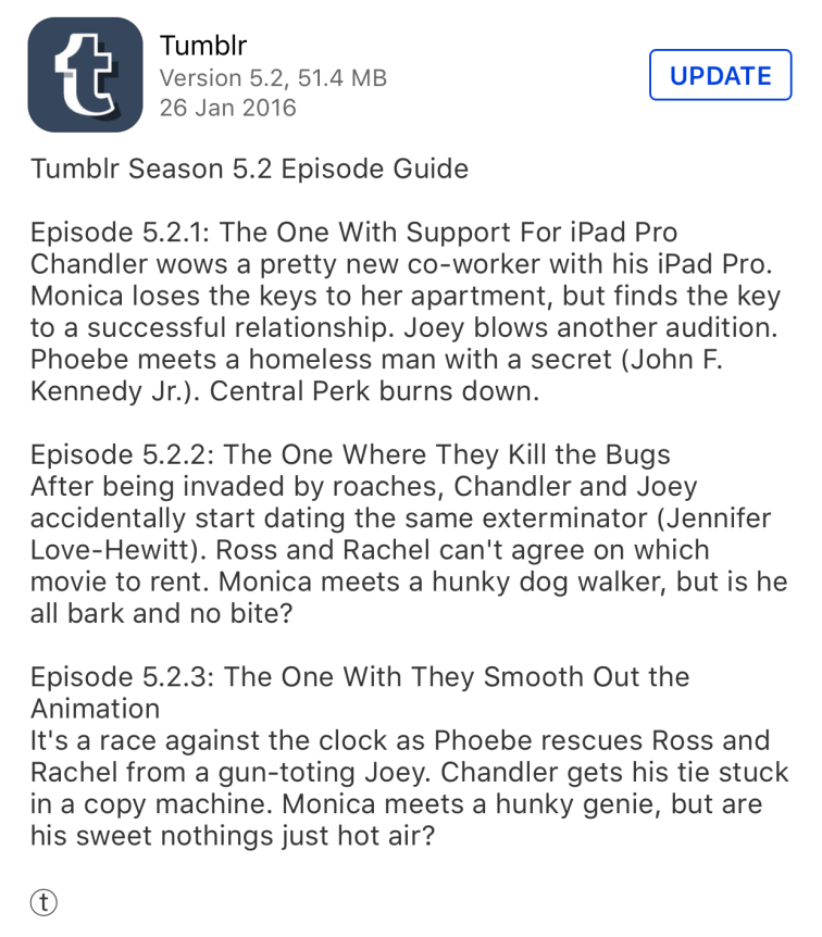
I love using Tumblr app update. It has the best update with Friends stories. I can immediately see that the update was to support iPad Pro, fix bugs, and smooth animation. A nice blend of humour and important information.
I hope to see frequent update of these apps so that I can read the copy. App updates can be fun, even when they are to inform the user of new features and changes. People do read it.
A moment before pressing Update
Maybe after reading this article, you will start checking the updates one by one instead of pressing “Update All”, which will remove all the excitements.
If you see any fun app updates, please let me know.
Update on 13 Feb 2016
Many apps have engaging copy in the updates. Following apps (on iOS) are mentioned in the comments by readers:
- Citymapper: its updates are clever in introducing new features in an understandable language. Thanks to Louis B on Designer News.
- Trello: long but very good copy, not for impatient readers. Love its watch release in update 2.9.1 — Apr 23,2015.
- Slack: usually very long list of bug fixes and features in updates but you can still see many witty remarks.
- Pocket Casts: a podcast app mentioned by Jason Berek-Lewis. Really like the update 4.6.3 (Aug 6, 2014).